Why Your AI-Designed Product Looks Like Everyone Else's
AI tools make products fast, but also generic. Learn why AI-designed products look alike and a 5-step process to make yours distinct.
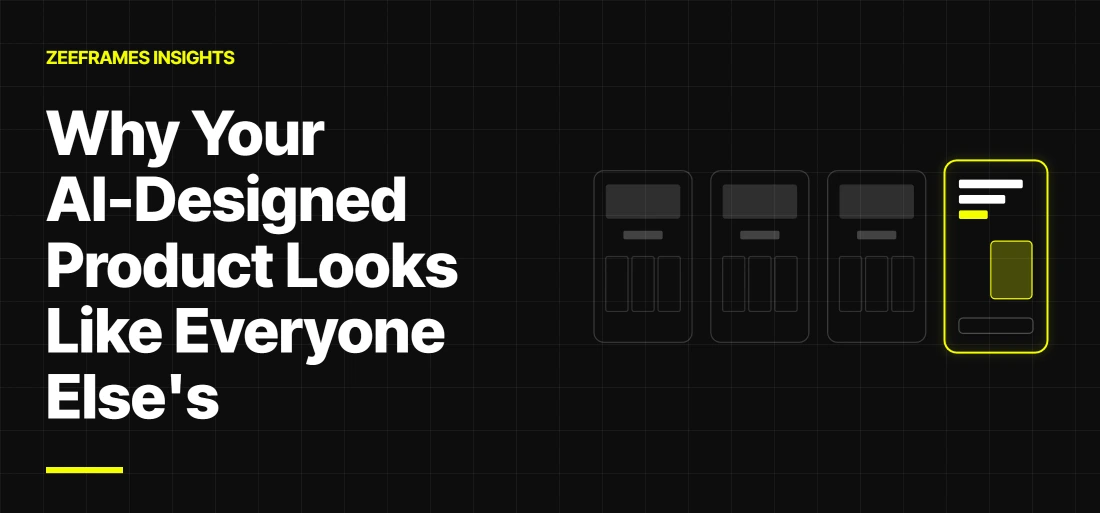
Open five AI-built products side by side and you will struggle to tell them apart. The same rounded cards, the same soft purple-to-blue gradient, the same hero with a centered headline and two buttons.
The speed AI gives you is real. The sameness is the price, and it costs a new product the one thing it needs most: a reason to be remembered. This post explains why AI-generated interfaces converge on one look, how to spot it in your own product, and a five-step process to fix it without giving up the speed.
Quick answer: AI-designed products look alike because AI tools predict the most common interface for a prompt, and many of them share the same defaults. To fix it, decide your positioning, brand constraints and design system first, ground the design in real user language, and have a senior designer review what the AI produces.
Why AI-designed products converge
AI tools return the most likely interface for your prompt, and the most likely interface is the average of everything already on the web. Three things push every product toward the same place.
- They learn from the average. Models are trained on huge volumes of existing interfaces and code. Ask for "a modern SaaS dashboard" and you get the pattern that appears most often, not the one that suits your users.
- They share defaults. Many AI builders reach for the same component libraries, the same utility-class styling and the same font stacks. Default spacing, corner radii and shadows ship with the output unless you override them.
- Prompts describe screens, not strategy. "A fintech app with a dashboard, cards and a transactions list" says what is on the screen. It says nothing about who the product is for, how it should feel or how competitors look. The model fills those gaps with safe choices.
Writers who have traced the problem describe a feedback loop. The best-known example is colour: in August 2025, Tailwind CSS creator Adam Wathan publicly, and semi-seriously, apologised for making indigo the default button colour in Tailwind UI, which he said had led every AI-generated interface to default to indigo (as reported by DEV Community).
Once AI-built sites are published, they can be scraped into the next round of training data, which pulls the average further toward the same look.
What the evidence says
The evidence comes from different fields but points one way: defaults spread, and sameness has a cost.
TABLE 1: EVIDENCE AT A GLANCE
Two cautions. The story-writing study measured short stories, not interfaces, and the Tailwind account is a widely repeated explanation rather than a controlled test. Treat both as strong signals, not proof that every AI-built product will look the same.
Five signs your product looks generic
If three or more of these describe your product, it is blending in.
- The hero could belong to anyone. Swap the logo and the headline still works for a dozen other companies.
- Every section is a symmetrical grid. Three feature cards, each with an icon, a short title and one line of text.
- The colors were never chosen. The palette is a default gradient or the accent the tool picked, with no reason behind it.
- There is no typographic voice. One default sans-serif at a handful of sizes, with weak contrast between headings and body text.
- The copy is interchangeable. Lines like "Supercharge your workflow" and "A seamless experience" could appear on any landing page.
The 60-second test: cover your logo and show your homepage to five people for one minute. Ask what the product does and who it is for. If they cannot say who it is for, the design is not doing its job.
The real problem is missing decisions, not weak tools
AI is excellent at producing options and poor at making choices that cost something, and differentiation is made of exactly those choices.
A distinctive product says no to something. No to the dense dashboard because its users are busy owners. No to playful because the money involved is serious. AI cannot know what you are willing to give up unless you tell it, and often nobody on the team has decided yet. Generic design is usually a symptom of decisions that were never made upstream.
TABLE 2: WHAT AI DEFAULTS TO VERSUS WHAT A DELIBERATE CHOICE LOOKS LIKE
How to fix it: a five-step process
Make the differentiating decisions first, then use AI to carry them out quickly. The order matters: AI works as an accelerator only after the direction is set.
1. Write a one-paragraph positioning brief
State who the product is for, the problem it solves, what competitors look like and the one thing you want users to remember. Paste this brief into every prompt so each screen starts from your point of view instead of the tool's average.
Copy this template into the first message of any AI design or build session:
2. Set brand constraints before you generate anything
Pick two or three brand adjectives, a palette you can explain, a type pairing and a direction for imagery and illustration. Add a "never do" list, for example no default purple gradients and no three-card feature row. Constraints are what make output recognisable.
3. Build your own design system, then feed it to the tool
Define tokens for color, type, spacing, corner radius and motion, plus a small set of core components. Give these to your AI tools so they build with your system instead of their defaults. A system also keeps screens consistent as the product grows.
Design tokens are named values for your visual decisions, such as a brand colour or a spacing step. The Design Tokens Community Group publishes an open JSON format for them; it is a community group report, not a W3C standard. Tell the AI tool to use token names only, never raw values, so a button asks for your brand colour instead of a framework default.
Example token file in the Design Tokens Community Group format. The value is a placeholder.
4. Ground the design in real user input
Talk to five users, read support tickets and collect screenshots of competitors. Use the real language you hear in headlines and labels, and let real tasks decide the layout. This is the input AI cannot invent for you.
5. Add a human craft review
Have a senior designer review at fixed points. Check hierarchy, spacing rhythm, accessibility and the cover-the-logo test. Look closely at the screens AI tends to skip: empty states, error states, loading states and long text.
For accessibility, check your result against WCAG 2.2, the W3C Recommendation for accessible web content. At level AA, body text needs a contrast ratio of at least 4.5:1 against its background.
Four ways to design an AI-built product
Setting direction first costs more up front than prompting alone, but it is the only approach below that keeps both speed and a distinct look.
TABLE 3: FOUR APPROACHES COMPARED (ZEEFRAMES ASSESSMENT, NOT MEASURED DATA)
Where AI helps and where a human should lead
Use AI for speed in execution, and keep strategy, taste and judgement with people. At ZeeFrames this is how we work: senior designers set the direction and the design system, and AI-powered workflows speed up the production that follows.
Let AI do the heavy lifting on:
- Generating layout variations to explore quickly
- First drafts of copy that a person then edits
- Producing states and variants from a system you have already defined
- Turning approved designs into front-end code
- Summarising user research notes
Keep these human-led:
- Positioning and brand direction
- Choosing which option to keep, and why
- Information architecture and user flows
- Accessibility and edge cases
- Final polish and the details that make a product feel considered
Pre-launch checklist: is your product distinct or generic?
Run this list before you ship; every unchecked box is a place where your product still looks like everyone else's.
- ☐ A one-paragraph positioning brief exists and is used in every prompt
- ☐ The palette and type pairing were chosen for a reason you can state
- ☐ Design tokens and core components are defined, and AI tools build from them
- ☐ The homepage passes the cover-the-logo test with five people
- ☐ Headlines and labels use words real users said
- ☐ Default gradients, stock icons and generic benefit lines are gone
- ☐ Empty, error and loading states are designed, not left to defaults
- ☐ A senior designer has reviewed hierarchy, spacing and accessibility
The verdict: which approach to choose
Match the approach to the stakes: a prototype can run on defaults, but a launch should not.
TABLE 4: WHICH APPROACH FITS WHICH SITUATION
The takeaway: decide first, then build fast
AI did not make products look the same; skipped decisions did. Speed is an advantage only when it is spent in a direction you chose on purpose.
Decide who the product is for, what it should feel like and what it will never do. Then let AI build it faster than you could before. That combination gives you the speed of AI and a product people remember.
If you have an AI-built product that feels generic, or you want a senior team to set the direction before you build, get a free UX review from ZeeFrames and we will show you where it blends in and how to change that.
FAQ
Q1. Why do AI-generated designs look so similar?
AI tools predict the most likely interface for a prompt, and many start from the same components and styling defaults. Without a clear brief and brand constraints, they fall back on the common pattern.
Q2. Can AI replace a UI/UX designer?
AI can speed up production, but it does not choose a positioning, understand your users or judge what feels right. Those decisions still need a designer.
Q3. How do I make an AI-generated design look unique?
Write a positioning brief, set brand constraints, define your own design system, use real user language and have a senior designer review the result.
Q4. Is it a problem if my MVP looks AI-generated?
Not for a prototype you use to test an idea. Before you charge customers or pitch investors, a generic look can make the product forgettable, so give it a distinct direction first. Table 4 shows which approach fits which stage.
Q5. How do I brief an AI tool so the output matches my brand?
Start every session with a positioning brief and your token file, list what the tool must never do, and ask it to use token names only. The template in step 1 is a starting point.
Related insights
- Generative UI 2026: Interfaces That Build Themselves Around Each User: adaptive interfaces for beginners and power users.
- AI Hype vs Reality: What Actually Works in 2026: a scorecard of what AI does well in coding, content and design.
- AI Toolkit of ZeeFrames: Superfast Vibe Coding: how ZeeFrames uses Lovable, Cursor, Replit, v0 and Bolt.new.
References
All sources below were checked on 11 November 2026.
- Alan West, Why Every AI-Built Website Looks the Same (Blame Tailwind's Indigo-500), DEV Community.
- Anil R. Doshi and Oliver P. Hauser, Generative AI enhances individual creativity but reduces the collective diversity of novel content, Science Advances 10(28), 12 July 2024, DOI 10.1126/sciadv.adn5290.
- Kate Moran, The Aesthetic-Usability Effect, Nielsen Norman Group, 3 February 2024.
- Jakob Nielsen, End of Web Design, Nielsen Norman Group, 22 July 2000.
- Design Tokens Community Group, Design Tokens Format Module 2025.10, Final Community Group Report, 28 October 2025.
- W3C, Web Content Accessibility Guidelines (WCAG) 2.2, W3C Recommendation, 12 December 2024.
- Collins Dictionary Language Blog, Collins' Word of the Year 2025: AI meets authenticity as society shifts, 6 November 2025.
رؤى ذات صلة


قرارك العظيم القادم بشأن المنتج يبدأ بمحادثة واحدة.
إذا لم يكن منتجك في المستوى الذي تريده، فقد تكشف لك 30 دقيقة معنا السبب. وفي الغالب، نحن الفريق المناسب تمامًا لإصلاحه.
احجز مكالمة استكشافية مجانية