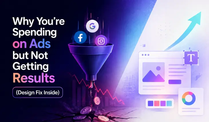
Why You’re Spending on Ads but Not Getting Results (Design Fix Inside)
Learn how small design mistakes like poor images, messy layouts, and hidden buttons are killing your ad results and how to fix them fast.
We see a lot of startup ads on a daily basis, and a few of them get our attention. Our eyes are continuously filtering through so much visual content, and we keep scrolling past the content that seems grainy.
This means that on social platforms, visuals are earning trust before we even visit the business page or website. The following community post also gives us insight that design does play an important role, and budget comes later in line.
This blog will help you to discover the design mistakes in your ads, so you must stop thinking that budget is the issue.
How Ads Work And Why Should You Care?
Let’s understand this through an example. Founders or startups get really excited to invest in Google Ads, let's just say. Digital marketers set up their accounts, decide on a budget, target their audience, add creatives, and then publish.
You did all the standard things, followed the guidelines, but you got no results. The problem here is not your
- Marketer
- Budget
- Timeline you choose
Instead of the blame game, you might put your focus on your DESIGN. This means you have to put more effort into your user experience. For example, if a billboard ad does not convince you to land on their website, they did the creative wrong. It's as simple as that. The following table might help you get an idea of where you stand.
This table provides you with the lack of synchronization between your ad and the landing page.
Below, we are going to dissect the ad design mistake and how we can fix it.
Design Mistakes You Need To Keep An Eye On
Most of the social media or digital marketers know that web design and user experience go hand in hand. And user experience does involve the visuals. So, the following are some of the common mistakes that usually get overlooked, along with their fixes.
Using Low Quality Images
Nobody sees ads or visuals that seem blurry, out of focus, mismatched images, or low-quality data. This design mistake can really put people off your creatives, leading to little to no conversions.
Your Typography is Wrong
Typography goes beyond choosing the primary or secondary font. Typography can make or break your brand image, yes, it's that powerful. A poor selection of typography can cause confusion, readability issues, and customer dissatisfaction. Poor typography can be recognized in two common ways:
Illegible fonts: Using the more artistic or stylized fonts to make it unique often leads to other ways around.
Poor letter spacing: Kerning (the space between) should be appealing to the eyes.
Off-Brand Colors
If you talk to a normal person who has never worked in marketing, they can easily tell you that brand colors should sync. This means that the usage of primary and secondary branding colors needs to be utilized in creatives, and one cannot go off colors under any circumstances. So when a person visits your website from an ad, it should give the same feel because you have used the same colors.
Messed Up Layout
This one is also very important. A messed-up layout means that too much content can be seen on an ad. The main message has been lost in the flood of other non-important content. Most successful ads have a clean layout.
Your CTA is Nowhere To Be Found
Usually there is a psychology that can be seen among immature ad creatives is that their CTA is somewhere on the corners of the design, and that is too little. This stunt can automatically reduce the chances of conversions because the ad isn’t telling people what to do next.
Conclusion
These are such common mistakes, but they might get overlooked most of the time. If someone on your team has identified such mistakes it's better to resolve things beforehand rather than making them an ego issue.
Usually, startups face such issues because they don’t invest in branding and collect bits and pieces from other brands or their competitors. This makes them look-alikes instead of making them stand out. Speaking of branding here is really important because a branding kit includes all these guidelines, which can save you from the hassle and maintain the brand reputation.

Frequently Asked Questions
Q: Is a low budget the primary reason ads fail?
A: Not necessarily. While budget matters, poor design and user experience are often the real culprits behind low conversion rates and lack of trust.
Q: Why is "ad-to-landing page" synchronization important?
A: Consistency in colors, headlines, and imagery between your ad and your website prevents user confusion and distrust, which helps lower your bounce rate.
Q: How do low-quality images affect my brand?
A: Grainy or mismatched visuals signal a lack of professionalism, causing potential customers to scroll past your content and lowering your overall conversions.
Q: What are the common typography mistakes in ads?
A: The two most frequent issues are using illegible, overly stylized fonts and having poor letter spacing (kerning), both of which hurt readability.
Q: What is a "messed up layout" in ad design?
A: This occurs when an ad is cluttered with too much non-important content, causing the core message to get lost. Successful ads typically feature a clean, focused layout.
Q: Where should the Call to Action (CTA) be placed?
A: The CTA should be prominent and clear. Placing it in a small font or hiding it in a corner makes it difficult for users to know what to do next, reducing conversions.
Q: How can a branding kit help my startup?
A: A branding kit provides design guidelines (colors, fonts, and styles) that ensure consistency across all platforms, helping your brand stand out rather than looking like a copy of competitors.
Related Insights


Your next great product decision starts with one conversation.
If your product isn't where you want it to be, 30 minutes with us might tell you why.And more often than not, we're exactly the team to fix it.
Book a Free Discovery Call